icon system - covermymeds
During my time at CoverMyMeds I was assigned to complete an audit of the company's icon and illustration system. This consisted of stakeholder interviews, competitor research, copywriting and eventual implementation of new design. This was a part of a CoverMyMeds brand refresh, organized by my supervisor, Shelly Klemmer.
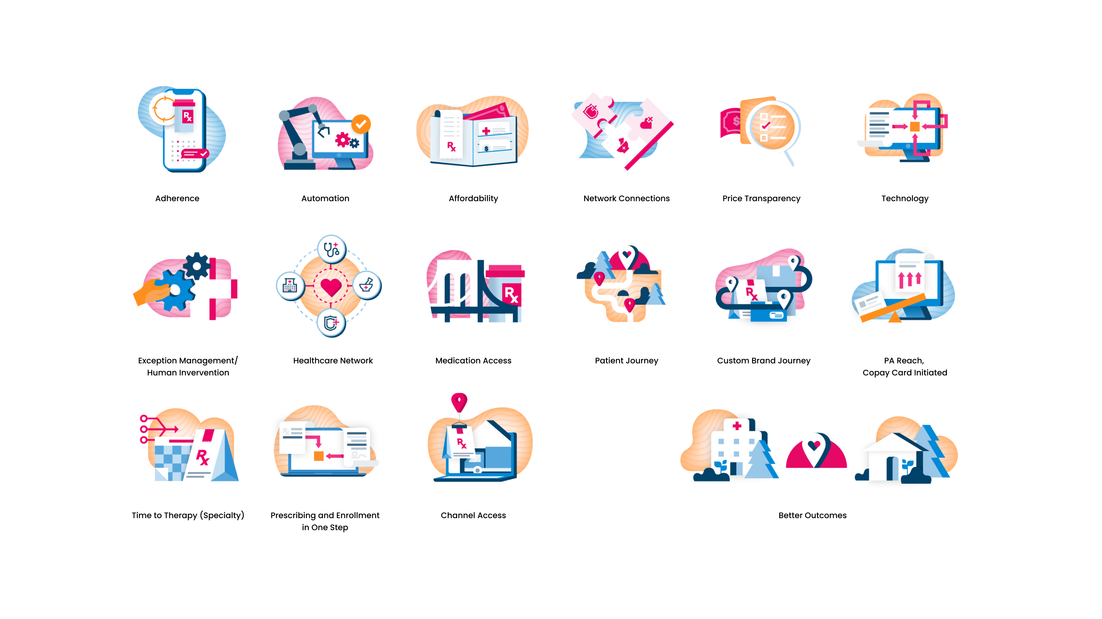
^ this is the fully updated icon set. I added 12 icons and adjusted the dimensions and rebuilt the existing set for system consistency.
CoverMyMeds’s goal with their updated icon set was to keep the system succinct and intentional. The list caters towards simplicity. Icons have multiple uses. It is better to skip out on using an icon than use them frivolously.
Additionally, I completed an audit on CoverMyMeds’s illustrations set. The first set featured their big brand colors, which felt overbearing & were difficult to use. I created a new visual style for their illustrations, utilizing gradients for breathability. I also created three additional illustrations in the original style based on need (see below).

Comparison of illustration styles. The shift was subtle but very effective, with softer shadows and the addition of gradients.

